Download and visualize COVID-19 case data in R
In this tutorial, you will download global 19-nCoV confirmed case data from the European Center for Disease Control (ECDC), and visualize it in R Studio. This tutorial includes the following steps:
- Prepare the environment: libraries
- Download the data
- Pre-process the data
- Select the countries of your interest
- Visualize (graph) the data with ggplot
- Save the graphs with ggsave()
Prepare the environment: (down)load the libraries
If you haven’t installed R studio, download it here. Although you can use another IDE, here are some reasons why I recommend R Studio. To (down)load the libraries, run this chunk of code:
# Install libraries
install.packages(c("dplyr", "ggplot2", "ggrepel", "zoo"))

# Load into environment
library(dplyr) # data manipulation
library(ggplot2) # graph
library(ggrepel) # graph labels
library(zoo) # dates
Download the data
Global case data for Coronavirus are available
here. Download and store it into a data frame called data, renaming the countriesAndTerritories to country for clarity:
# Download data
data<-read.csv("https://opendata.ecdc.europa.eu/covid19/casedistribution/csv")%>%rename(country=countriesAndTerritories)
# Explore the data format
str(data) # structure
head(data) # see 10 first rows
Pre-process the data
To make the data manipulation easier, let’s:
- Change the
dateRep(or reporting date) format to theDatetype with thezoopackage - Create the
dsfc, or “days since first case reported” column, that specifies how many days have passed since the first confirmed reported case and each new report - Create the
totalCasescolum with the accumulated cases per country
# Transform dateRep to Date format
data<-data%>%mutate(date=as.Date(dateRep, '%d/%m/%Y'))

# Calculate the days since the first reported case
data<-data%>%arrange(country, desc(date))%>%filter(cases>0)%>%
             group_by(country)%>%mutate(dsfc=date-min(date))

# Calculate accumulated cases
data<-data%>%mutate(totalCases=NA)
for(i in (dim(data)[1]):1){
  if(i==dim(data)[1]){
    data$totalCases[dim(data)[1]]<-data$totalCases[dim(data)[1]]
  }
  if(i!=dim(data)[1]){
    if(data$country[i+1]==data$country[i]){
     data$totalCases[i]=(data$totalCases[i+1]+data$cases[i])
   }
    if(data$country[i+1]!=data$country[i]){
     data$totalCases[i]=data$cases[i]
   }
  }
}
Select the countries of your interest
Make a vector with the names of the territories you’d like to plot. Here we select some Latin American countries:
# Territory names to plot
data$country%>%unique() # See unique territory names for spelling
la<-c("Argentina", "Bolivia", "Brazil", "Mexico", "Peru", "Uruguay", "Dominican_Republic")
Visualize (graph) the data with ggplot
There’s been some debate concerning the “correct” way to visualize case data for COVID-19 (see this twitter thread). Here we will graph the data in 3 ways :
A) Accumulated cases per million inhabitants (y-axis) VS days since first case reported (x-axis)
B) Accumulated cases per million inhabitants (y-axis) VS days since first case reported per million inhabitants (x-axis)
C) Logarithm of the accumulated cases per million inhabitants (y-axis) VS days days since fist case per million inhabitants (x-axis).
The next chunk of code:
- Filters
datafor the countries in thelavector - Graphs both lines and points with
geom_lineygeom_point - Assigns a different color to each country
aes(color=country) - Modifies the axis labels with
xlabandylab - Labels the last day reported for each country, minimizing label overlap with
geom_label_repel
# A- Visualize accumulated cases per million inhabitants since the first case was reported
ggplot(data%>%filter(country%in%la)) +
geom_line(aes(x=dsfc, y=totalCases/(popData2018/1000000), color=country)) +
geom_point(aes(x=dsfc, y=totalCases/(popData2018/1000000), color=country)) +
xlab("Days since first case confirmed") +
ylab("Accumulated cases per million inhabitants") +
geom_label_repel(data=data%>%filter(country%in%la)%>%
group_by(country)%>%
summarize(dsfcmax=max(dsfc), totalCasesmax=max(totalCases),
popData2018=max(popData2018)),
aes(x=dsfcmax, y=totalCasesmax/(popData2018/1000000) ,
label=country, color=country),
size=2, show.legend = F) +
theme_bw()

# B- Visualize accumulated cases per million inhabitants since the first case per million inhabitants was reported
  # Calculate days since 1 case/million inhabitants was reported
data1<-data%>%mutate(popMillon =popData2018/1000000)%>% filter(totalCases>=popMillon)%>%
group_by(country)%>%mutate(dscpm=date-min(date))

ggplot(data1%>%filter(country%in%la)) +
geom_line(aes(x=dscpm, y=totalCases/(popData2018/1000000), color=country)) +
geom_point(aes(x=dscpm, y=totalCases/(popData2018/1000000), color=country)) +
xlab("Days since 1 case/million inhabitants confirmed") +
ylab("Accumulated cases per million inhabitants") +
geom_label_repel(data=data1%>%filter(country%in%la)%>%
group_by(country)%>%
summarize(dscpmmax=max(dscpm), totalCasesmax=max(totalCases),
popData2018=max(popData2018)),
aes(x=dscpmmax, y=(totalCasesmax/(popData2018/1000000)) ,
label=country, color=country),
size=2, show.legend = F) +
theme_bw()

# C- Visualize log of accumulated cases per million since 1 case per million was reported
ggplot(data1%>%filter(country%in%la)) +
geom_line(aes(x=dscpm, y=log(totalCases/(popData2018/1000000)), color=country)) +
geom_point(aes(x=dscpm, y=log(totalCases/(popData2018/1000000)), color=country)) +
xlab("Days since 1 case/million inhabitants confirmed") +
ylab("Log of accumulated cases per million inhabitants") +
geom_label_repel(data=data1%>%filter(country%in%la)%>%
group_by(country)%>%
summarize(dscpmmax=max(dscpm), totalCasesmax=max(totalCases),
popData2018=max(popData2018)),
aes(x=dscpmmax, y=log(totalCasesmax/(popData2018/1000000)) ,
label=country, color=country),
size=2, show.legend = F) +
theme_bw()
Figure A
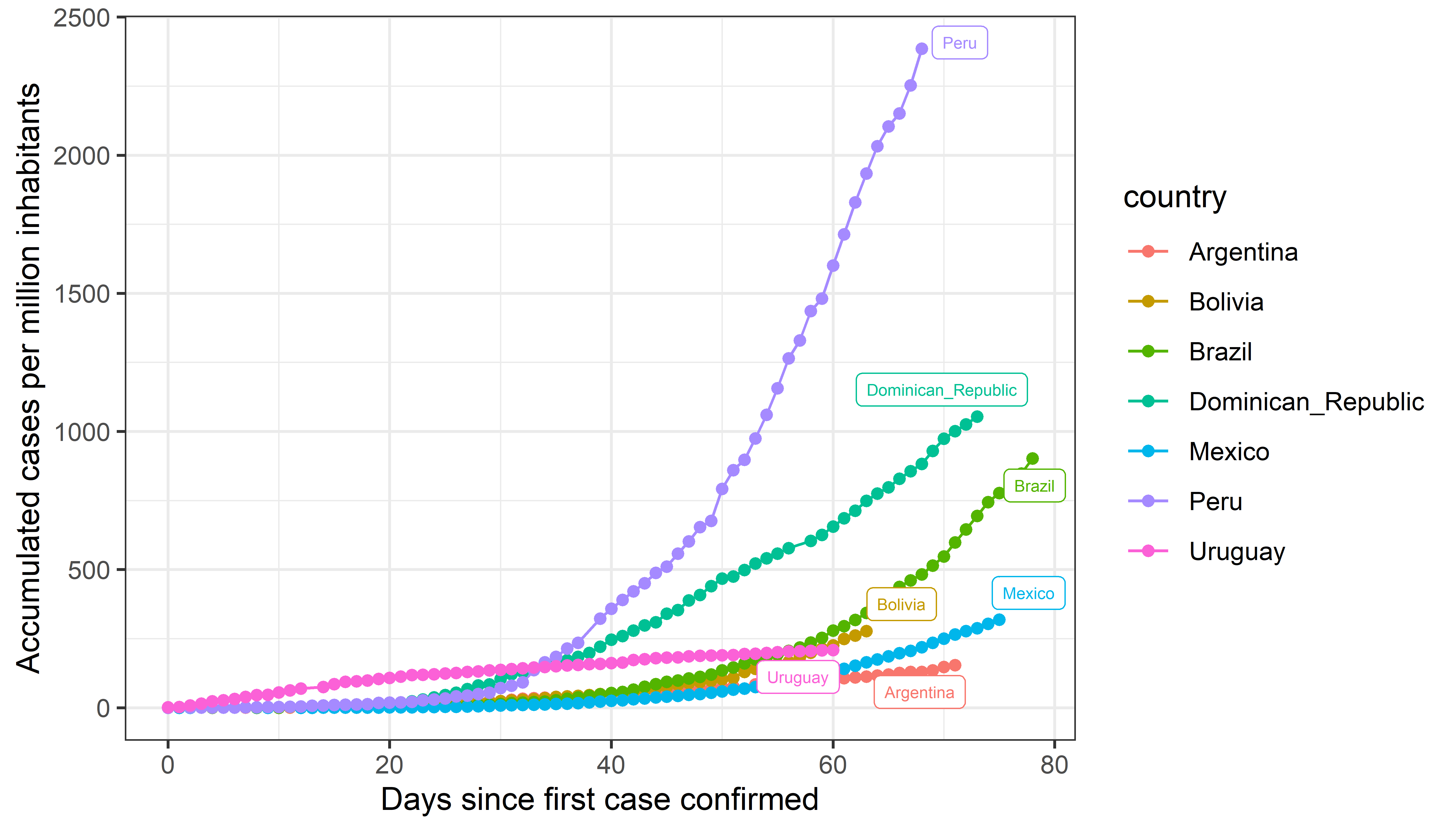
This graph is similar to the ones that were widely circulated at the beginning of the pandemic. However, it tends to disproportionately disfavour countries with large populations (for example, Peru can seem to have more cases than other countries). Carl T. Bergstrom proposed to that, instead of the days since a number of cases were reported, the x-axis indicate the number of days since a specific percentage of the population was confirmed to have the virus (see figure B).
Figure B
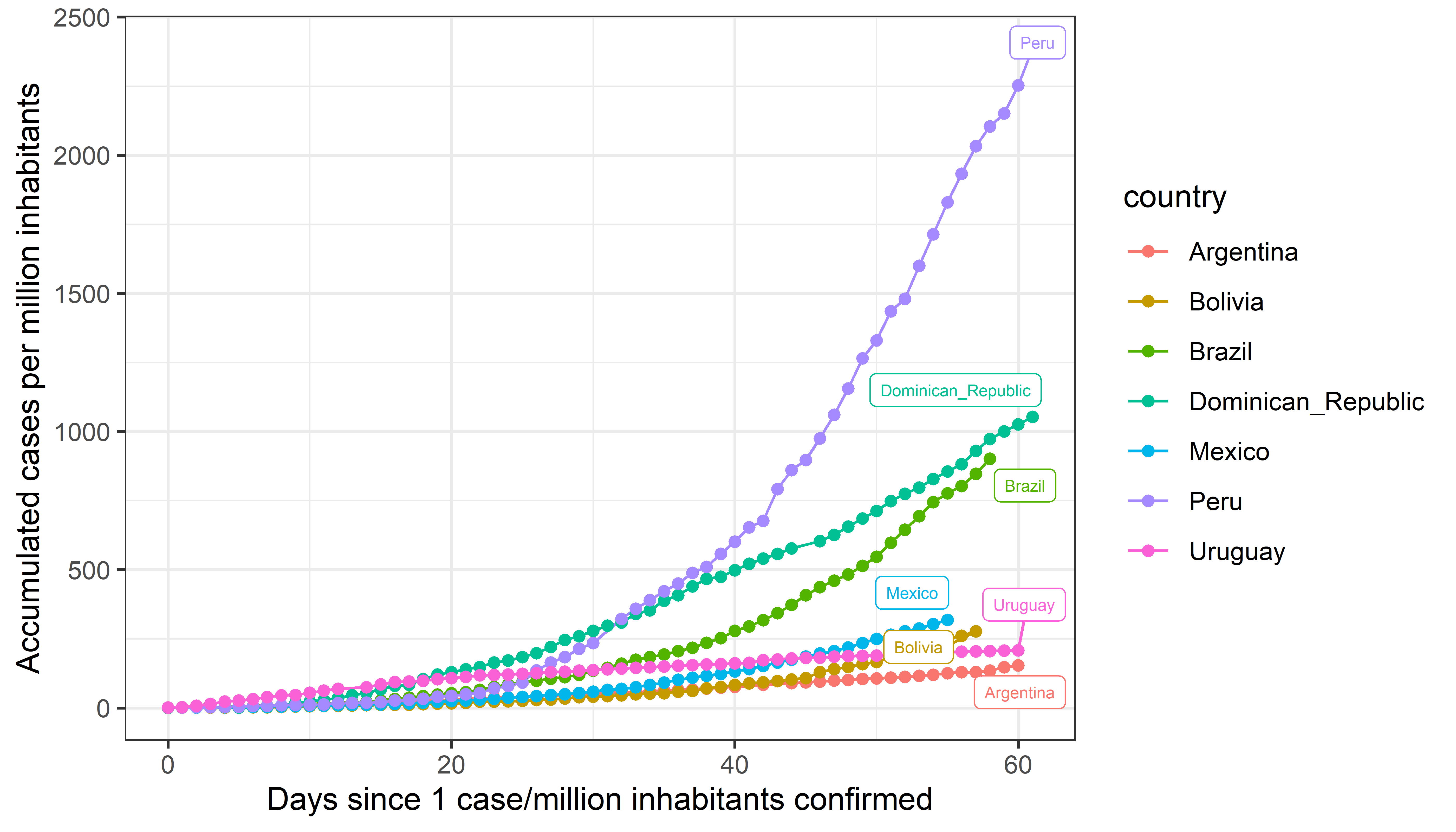 In this figure, the x-axis indicates the number of days that have passed since 0.0001% (1 for each 1,000,000 inhabitants) of the population was confirmed with the virus in each country; feel free to adjust this number based on your needs. However, the exponential growth might make it hard to interpret (see figure C).
Figure C
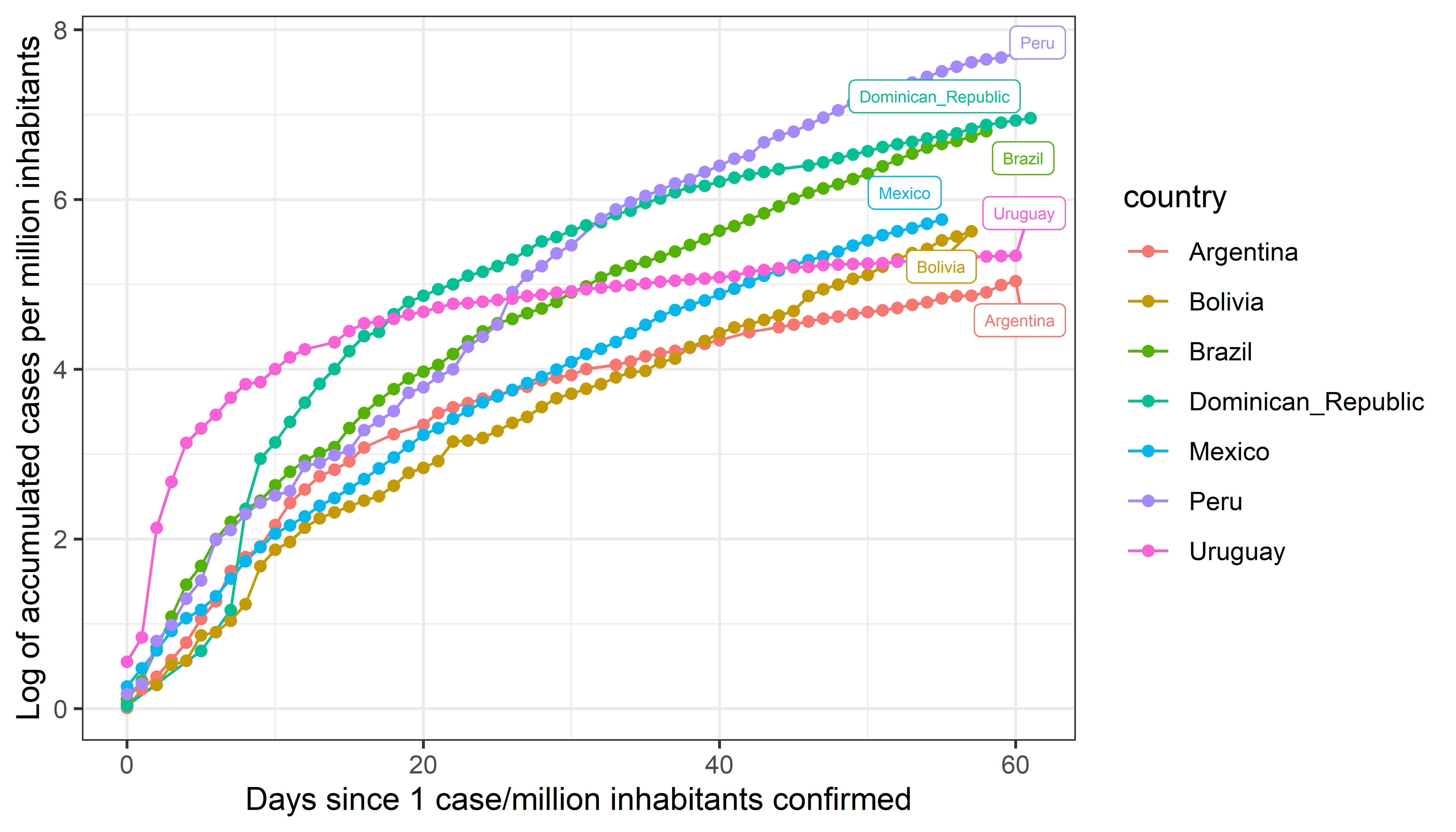
In this third graph, the log scale on the y-axis makes interpretation a bit more intuitive. The slope reflects the rate of growth of the accumulated cases, while the height is proportional to the % of population infected in each country. It’s worthy to highlight that Peru might still seem to have a lot more cases than other countries, but this is likely due to the number of tests that Peru has done compared to other Latin American countries.
These three ways to visualize case data are explained in this Twitter thread.
Save the graph with ggsave()
This code saves the graph on display in png format in the pathfolder/example and with file name covid19-cases. To change the format, substitute png for one of the strings in c("jpeg", "tiff""eps", "ps", "tex", "pdf", "jpeg", "tiff", "png", "bmp", "svg" o "wmf")
# Save the graph in display with ggsave()
ggsave("folder/example/covid19-cases.png",
device="png", dpi=800,
width=unit(7, "in"), height=unit(4 ,"in"))
See Spanish version of this tutorial.
If you have questions, feel free to contact me.